CONVERSE: SOCIAL COMMUNITY IMPACT
Role: Art Director
Converse Social & Community Impact (SCI) is the arm of Converse dedicated to supporting communities, fostering creativity, and driving positive social change. As part of their mission to connect more deeply with the people they serve, Converse SCI needed a refreshed brand identity that reflected both their bold, iconic roots and their commitment to inclusivity and empowerment.

LOGOS
The primary logo takes a minimalist approach, pairing the bold Denton font with Converse’s iconic Chevron. Stacked together, it creates a compact, timeless mark that feels strong on its own while reinforcing the program’s identity.


COLOR
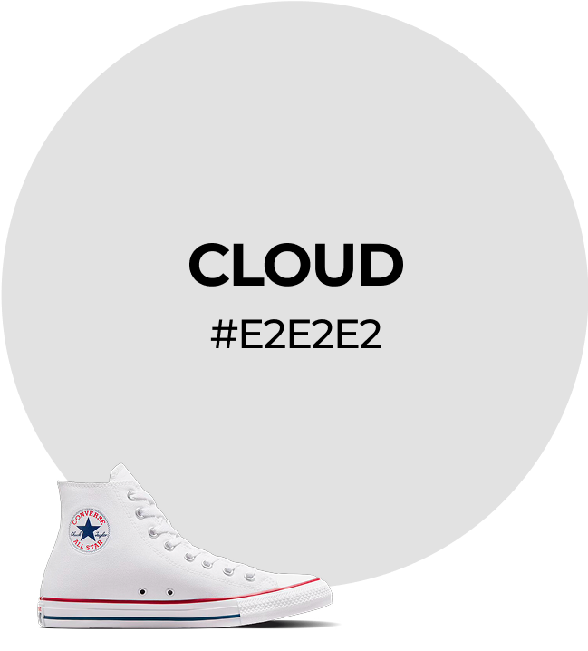
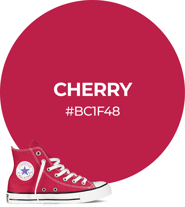
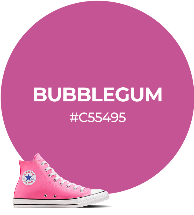
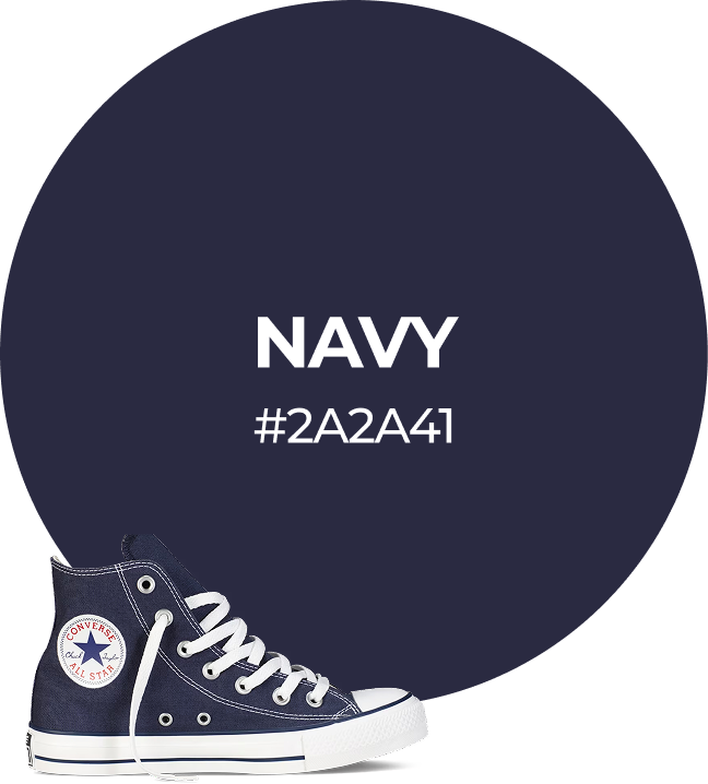
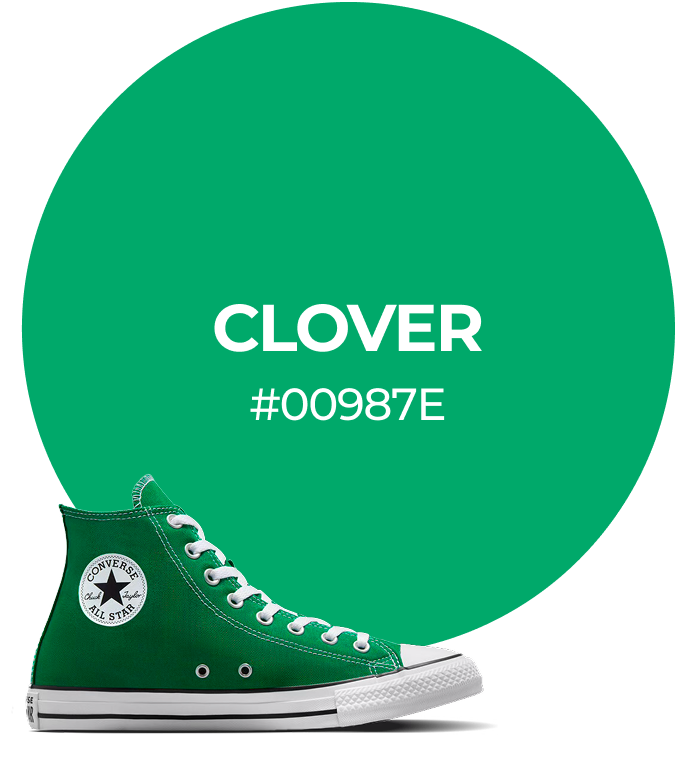
The Converse SCI color palette reflects the brand’s bright energy and draws inspiration from a few of the classic Chuck shoes. Sunflower, Onyx, and Cloud are used as the primary color palette, while Bubblegum and Clover are used for the secondary color palette.



DESIGN ELEMENTS
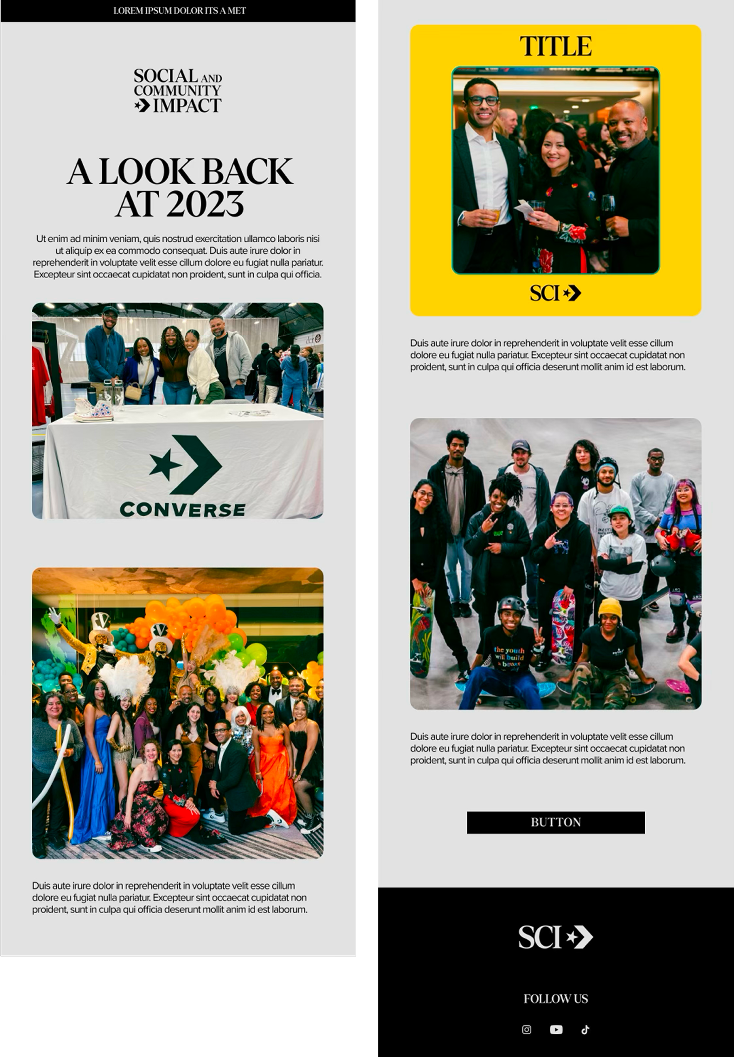
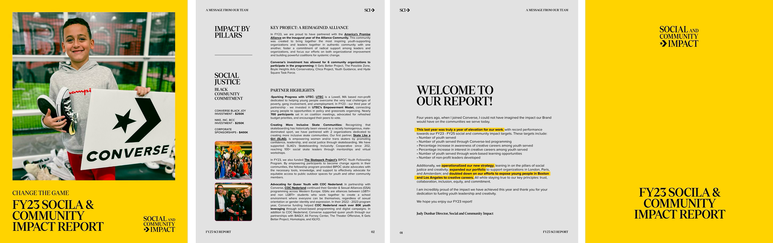
We designed minimal graphic elements to add emphasis without overwhelming the visuals. Underlines break up long titles, circles highlight key words, and arrows guide the viewer’s eye, all rooted in the Converse SCI color palette for consistency.

APPLICATION


TEAM
CREATIVE DIRECTOR: Sanja Komljenovic
GRAPHIC DESIGNERS: Miki Grujic + Harleigh Roberts